No items found.
Trends and Reports
What the iPhone Duo changes for your website, brand, and app
Apple's first foldable ships October 23. We went looking for the new design rules and mostly found old ones wearing a hinge. The few that are new are worth an afternoon.
The Company Advice Team
Posted on
October 13, 2026


Key Takeaways
- Most responsive websites will work on the iPhone Duo without a redesign. Safari doesn’t tell websites when the phone is folded, so a page only sees its width change, from about 466 pixels on the outer screen to about 951 on the inner one.
- The bigger design change is the shape of the screen. Both Duo screens are roughly 1.4 to 1, compared with about 2.2 to 1 on a standard iPhone, so full-height hero images and tall mobile layouts will crop differently.
- Test the one journey that makes you money, and unfold the phone halfway through the form. If what someone typed disappears when the layout changes, that’s the bug most worth fixing before October 23.
- Native apps built on Apple’s standard components need little work. Telehealth video and photo-based insurance claims are the exceptions, because the Duo’s front camera moves depending on which screen is in use.
A well-built responsive site should work on the iPhone Duo. The real risks are squarer screens, forms that reset on unfold, and camera-heavy apps.
Will my website work on the iPhone Duo?
Probably, if it was built with responsive layouts at any point in the last decade. If you’re not sure, schedule a free audit with The Company Advice.
Apple announced the Duo on September 9 with a 5.4-inch outer display and a 7.6-inch inner one, both with matching aspect ratios. Almost everything written about it since then, including a lot of confident Reddit threads, is inference from Apple documentation (and spec roundups), a handful of controlled press demos, and whatever people learned from Samsung and Google foldables. The phone isn't in anyone's pocket yet. Anyone selling you a "Duo-optimized website" package this month also probably has a bridge to sell ya.
What we can say with some confidence is how the web sees the device. Apple tells native apps where the hinge is, and Safari doesn't pass any of that along to websites. Chrome shipped the Viewport Segments and Device Posture APIs that let a page know where a fold sits, and Safari hasn't adopted either. Basically, your site gets a rectangle, and the rectangle changes size when the phone opens, closes, rotates, or gets squeezed into half the screen by Split View.
We're using the widths below as test checkpoints. They come from our Figma frames and will move a few pixels once real devices are in hand:
- 375 px, the common narrow phone, still the floor.
- 466 px, the Duo's outer display in portrait (our frame is 466 × 678).
- About 476 px, half the inner display in Split View.
- 600 to 700 px, the awkward middle where most sites switch navigation patterns or add a second column, and where most of the bugs will live.
- 951 px, the inner display in landscape (our frame is 951 × 669). Inner portrait flips that to 669 × 951.
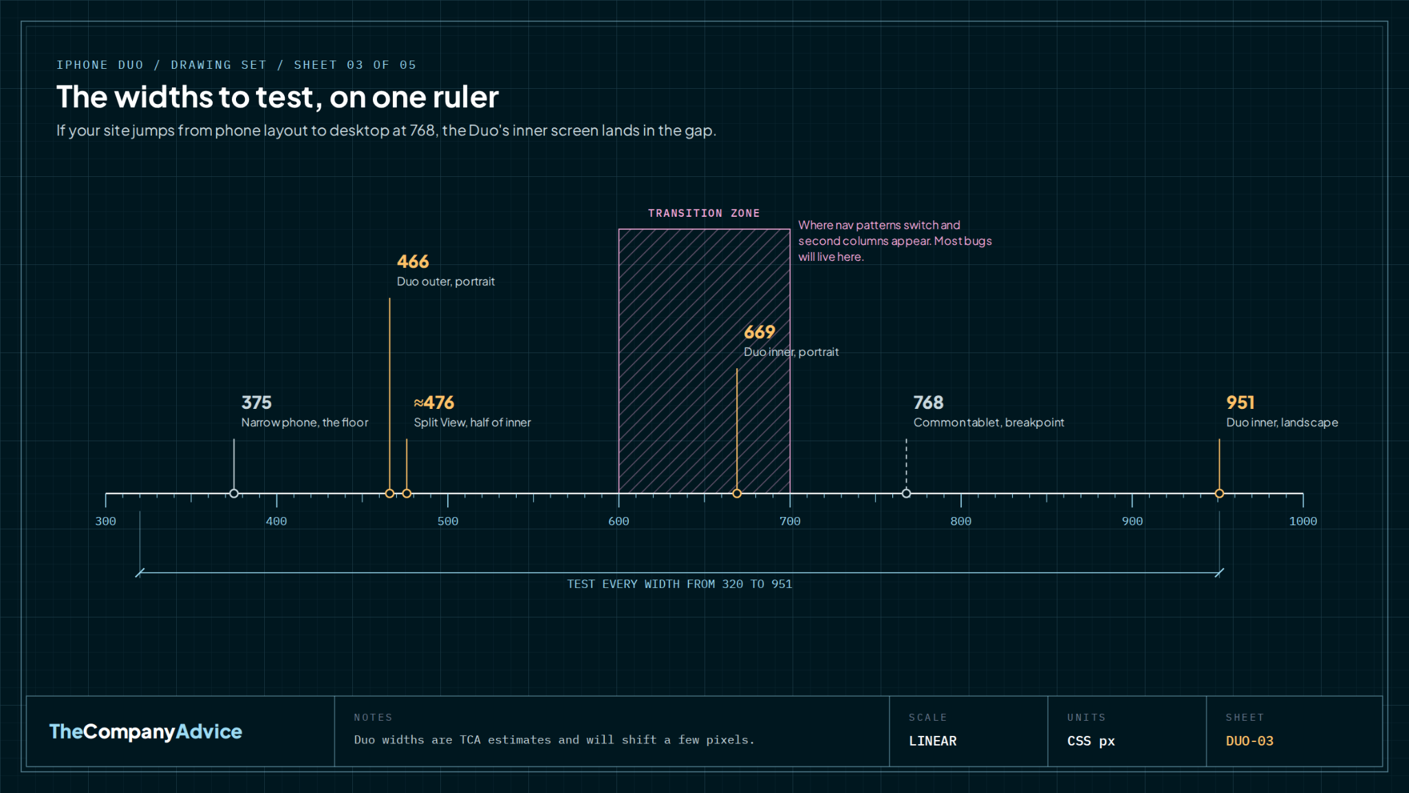
If your site already behaves between 320 and 950 pixels wide, you've done most of the job. If it jumps from a phone layout straight to a desktop layout at 768, the Duo's inner screen is going to land in the gap, and that's where desktop navigation ends up squeezed into a screen the size of a paperback.
What does the iPhone Duo change for brand and visual design?
The shape of the screen, which matters more than the size.
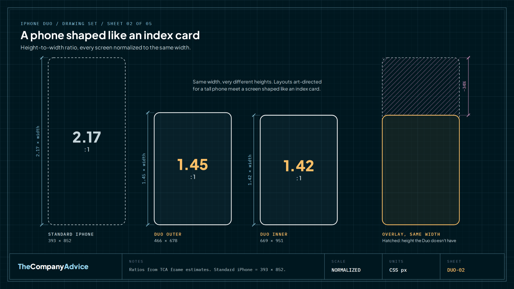
Do the arithmetic on the frames and the Duo turns out to be a much squarer phone. A standard iPhone in portrait is a little over twice as tall as it is wide. Both Duo screens are closer to 1.4 to 1. Apple built a phone whose screens, folded or open, are shaped more like an index card than a phone.
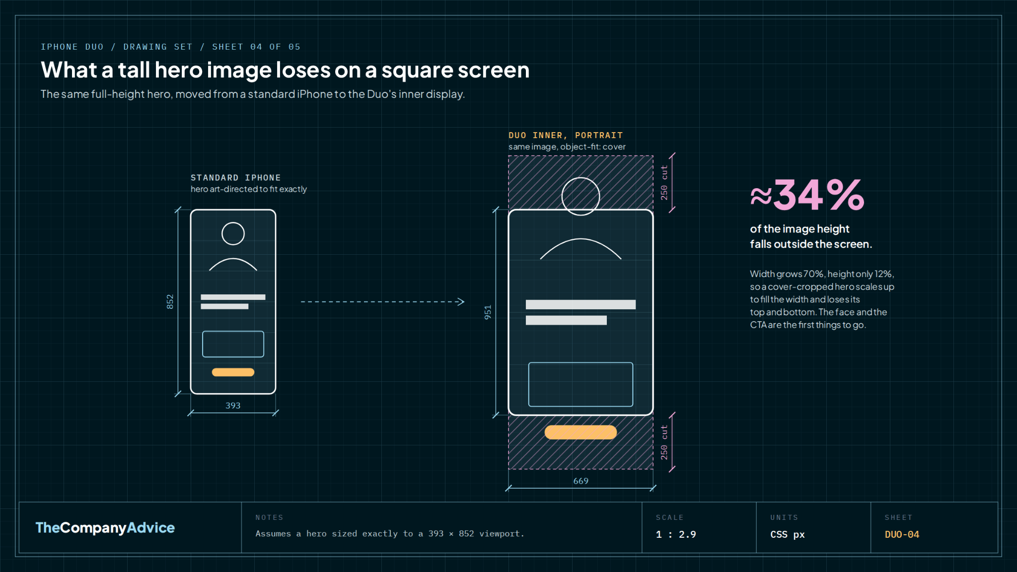
Most mobile brand work of the last five years was art-directed for the tall, skinny phone, from full-height hero images to logo lockups stacked to fill a narrow column. On a squarer screen those choices crop differently. Take a hero image sized to fill a standard iPhone screen exactly. On the Duo’s inner portrait screen, the width grows by roughly 70% and the height by only about 12%, so the image scales up to fill the width and about a third of it ends up off screen. That’s roughly 250 pixels lost at the top and another 250 at the bottom. If your product shot or your founder's face lives near the edge of that image, check it.
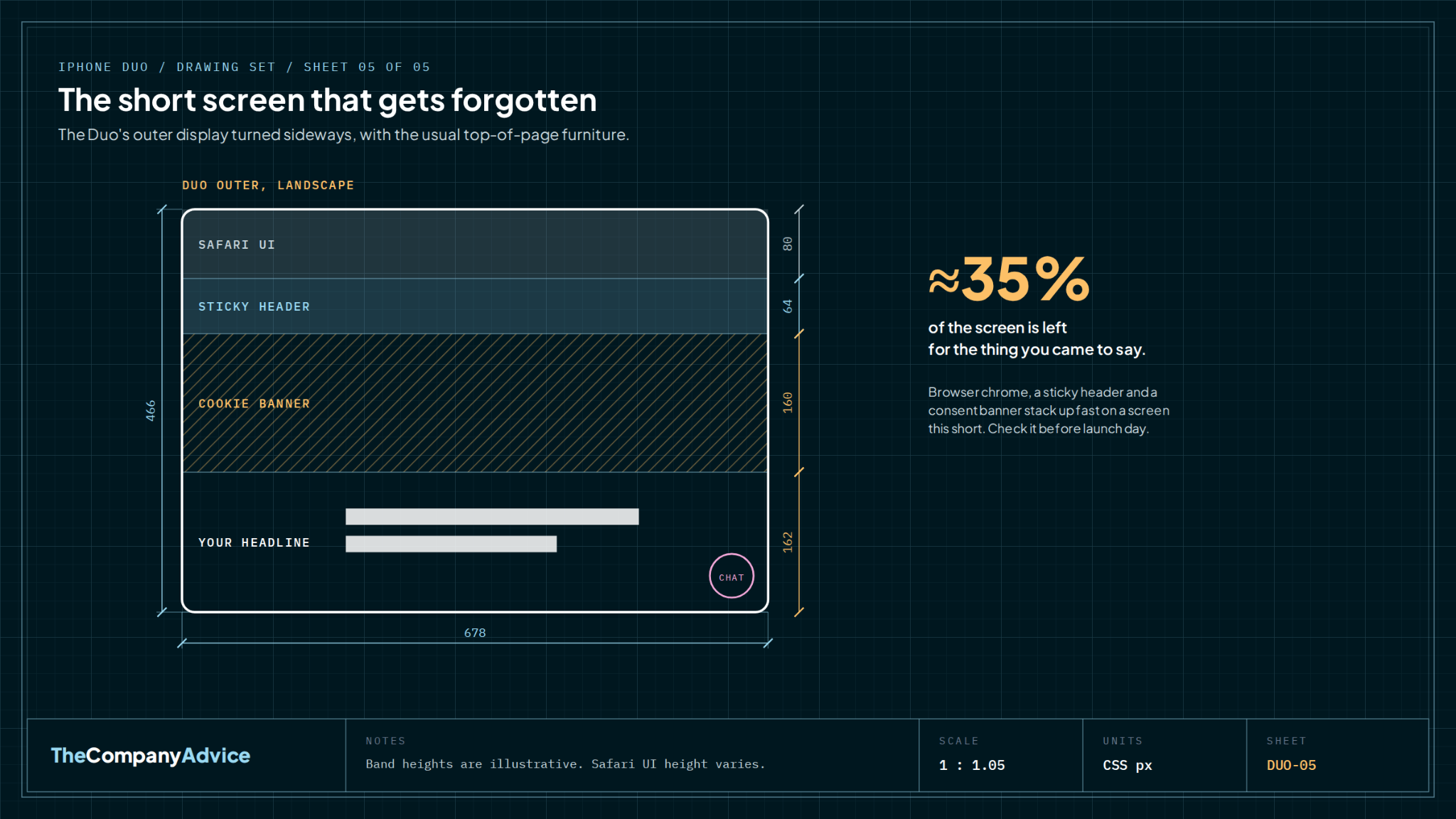
The outer screen in landscape is the other shape to worry about. It's roughly 466 pixels tall before Safari's own toolbar takes its share. Stack a sticky header, a cookie banner, and a chat bubble on top of that, and your headline is fighting for about a third of the screen.
For brand systems, the practical ask is small. Make sure your logo has a compact mark that works where the full horizontal lockup doesn't, and art-direct hero crops by aspect ratio instead of by device name. For social creative, 4:5 and square formats will likely sit more comfortably on these screens than 9:16, though the apps decide how that renders and we'd want to see it on a device before rebuilding anything.
We couldn't find a single new interaction pattern worth designing for. The experiments floating around are mostly fun, like games, an origami tutorial, and an accordion app where the fold is the bellows. They are delightful. But none of them apply to your pricing page.
What should marketing teams test before October 23?
One journey, done properly, beats a full-site audit.
The Duo starts at $1,999. It will be a small slice of almost everyone's traffic for a while. So check your analytics before you spend a dollar. If you already have Samsung Fold and Pixel Fold visitors, look at how they convert compared with everyone else. That's the best preview you have of whether foldable users are a segment worth serving.
Whatever the number says, one test is cheap enough to run anyway. Pick the journey that makes you money, the demo request or the checkout, and walk it at every checkpoint above plus the short landscape heights. Then fill in half the form on the outer screen, unfold the phone, and see whether your data survived. Unfolding resizes the viewport without navigating, which should be harmless. It stops being harmless when a script measured the screen once on load and rebuilds the component when the size changes, or when a layout swap unmounts the form.
Designing for continuity means the half-typed insurance quote is still there on the bigger screen.
Split View deserves a separate look. Apple says it lets people run two apps side by side on iPhone for the first time, and we expect buyers to use it for comparison. Your pricing page at 476 pixels next to a spreadsheet or a competitor's site is a realistic scenario for a considered B2B purchase. If your pricing table turns into a horizontal scroll at that width, fix that before anything else on this list.
Do native apps need to be redesigned for the iPhone Duo?
Most don't. A few categories we work with do.
Apps built on Apple's standard components inherit most of the right behavior for free. The developer community is fairly united on this, and Apple's own launch partners (Netflix, Zoom, and Slack were named) are mostly adapting existing layouts. Native work gets specialized when an app has manually laid-out controls, custom full-bleed surfaces, camera workflows, multiple windows, or a real reason to make the hinge part of the interaction. Apps get things the web doesn't, including the hinge position, reserved regions around it, both displays, and camera context.
Two of those exceptions hit our clients directly. Telehealth apps are camera workflows with a custom full-bleed video surface, and the Duo moves the front camera depending on which screen you're using (under the inner display, on the outer one). Insurtech claims apps often ask someone to photograph damage, and the Duo supports rear-camera selfies with an outer-screen preview. In both cases, "where does the person look, and where is the camera" now has two answers. If your app does either, budget real design and QA time. If it's forms and dashboards on standard components, budget a test pass.
Who is actually going to hold this phone?
We don't know yet, but we have a guess…
A $1,999 first-generation device from Apple tends to land with people who buy expensive things early and can expense them 🤑. We haven't seen buyer data, so treat this as a hunch.
Our hunch is that in the first six months, the person most likely to open your pitch deck on a folding phone is the person deciding whether to fund you.
That makes a couple of low-effort checks worthwhile for founders who are raising. Open your deck link and your homepage on a squarish screen and on a half-width one. PDFs built as tall mobile scrolls or wide 16:9 slides both have a way of shrinking to unreadable in the wrong frame. This is fifteen minutes of work, and it's the only Duo task on this list we'd call urgent.
Where we landed
The honest version of iPhone Duo readiness is boring, and we think boring is correct!
Responsive design already solved most of this. The new parts are a squarer screen, a hinge the web can't see, Split View on a phone, and two camera positions for the apps that care. We'll update this post once the phone is in real hands and our frame estimates meet actual devices. If you want a second pair of eyes on your revenue-critical journey before October 23, we're running that check for a few teams this month. It takes us about an afternoon, and we'll tell you if the answer is “you're fine.”
About the authors
Lubna Hameed is the Chief Design Officer and co-founder of The Company Advice. She brings 20+ years of experience designing and launching digital products, with work spanning product strategy, UX/UI and brand design. As a fractional design leader, she helps early-stage teams understand their users, turn complex workflows into intuitive experiences and bring products from concept to launch.
Marlena Sarunac is the Chief Marketing Officer and co-founder of The Company Advice, a fractional marketing and design agency for pre-Series C health tech and insurtech startups. She has 15+ years of marketing leadership across health tech, insurtech, and B2B SaaS, and writes about positioning, GTM, and the messy middle of fractional marketing.
Sources
- Apple Newsroom, "Apple unveils iPhone Duo," September 2026. https://www.apple.com/newsroom/2026/09/apple-unveils-iphone-duo/
- MacRumors, "iPhone Duo launching October 23," September 22, 2026. https://www.macrumors.com/2026/09/22/iphone-duo-launching-october-23-twelve-features/
- iPhone Duo Support, "Websites on iPhone Duo: Safari can't see the fold," September 2026, citing Apple Tech Talks 111461 and 111466. https://iphoneduosupport.com/blog/websites-on-iphone-duo/
- The Company Advice internal design frames and test checkpoints, September 2026.

Frequently asked questions
01
Do I need a separate website design for the iPhone Duo?
No. The iPhone Duo shows websites in Safari at widths between roughly 466 and 951 pixels depending on whether it's folded, rotated, or in Split View. A responsive site that works from 320 to 950 pixels wide already covers it. Safari doesn't expose the fold to web pages, so there's nothing device-specific to design for on the web. Put the effort into testing your most valuable page at those widths and making sure layout changes don't break or reset anything.
02
What are the iPhone Duo's screen sizes in pixels?
Apple lists a 5.4-inch outer display and a 7.6-inch inner display with matching aspect ratios. Our working design frames, which are estimates until real devices are tested, are 466 × 678 for the outer screen in portrait, 678 × 466 in landscape, 669 × 951 for the inner screen in portrait, and 951 × 669 in landscape. Half-screen Split View on the inner display is about 476 pixels wide. Expect these to shift by a few pixels once teams measure shipping devices.
03
Can a website detect when the iPhone Duo is folded?
Not today. Chrome supports the Viewport Segments and Device Posture APIs, which tell a page where a fold is and how the device is positioned, but Safari hasn't adopted them. On the Duo, a website only sees the viewport resize. Treat fold-aware layouts as a progressive enhancement for Android foldables and keep your core experience driven by available width, using container queries and resize observers rather than a screen size measured once on load.
04
Will the iPhone Duo affect conversion rates on my website?
For most businesses, not measurably at first, because a $1,999 phone will be a small share of traffic. The risk is concentrated in forms and checkouts. If unfolding the phone triggers a layout change that clears entered data, you lose that visitor. Check how existing foldable users (Samsung and Pixel) convert in your analytics as an early signal, and test your highest-value form by filling it in on the outer screen and then unfolding the device.
05
Which apps need the most work for the iPhone Duo?
Apps built with Apple's standard interface components get most of the adaptation automatically. The ones that need dedicated design and engineering time use custom layouts, full-bleed media, camera capture, multiple windows, or interactions tied to the hinge. For health tech and insurtech, that usually means telehealth video and photo-based claims or onboarding, because the Duo has different camera positions on the inner and outer displays and supports outer-screen previews for the rear camera.