Best Product Design -
Judge Scorecard
Desktop recommended
.jpg)

What part of the experience are you submitting?
The attached flow demonstrates the core Counsel experience: a member seeking guidance for a medical concern, interacting with Counsel AI, and seamlessly adding a physician to the conversation to receive end-to-end care.
What does your product do, and who is it for?
Counsel is designed for adults who want clarity and continuity throughout their health journey. From everyday health questions to new symptoms, prescriptions, lab testing, and ongoing condition management, our members seek timely, personalized, and secure guidance that fits their lives. Many members describe Counsel as having a “doctor in their pocket,” enabled by an AI-native model that delivers longitudinal support in one place.
Counsel’s product experience is built to meet this core need by combining safe medical AI with in-house physicians licensed in all 50 states. Every interaction begins with Counsel AI, where members share their concern or question. Counsel AI retrieves relevant prior interactions, medical history, and health memories to provide initial, context-aware guidance, ensuring care never has to reset. When a concern requires physician involvement, Counsel AI recommends adding a clinician, or members can escalate with a single click. From there, physicians can discuss next steps, refill medications, order labs, or provide deeper clinical insight within minutes.
Counsel is designed for people who want a modern healthcare experience that feels calm, contextual, and human—powered by AI, but grounded in physician oversight, clinical safety, and trust. By resolving most concerns through messaging while maintaining seamless access to doctors when needed, Counsel delivers a continuous, responsive experience built around how people actually seek care today.
Why does this work stand out?
Counsel stands out because its care delivery model addresses one of the most consequential shifts in modern healthcare: patients are increasingly turning to AI as the first point of care, yet most existing systems were not designed with clinical safety, guardrails, or trust at their core. Counsel was built specifically for this new reality.
Rather than treating AI as a standalone solution, Counsel pairs safe medical AI with in-house physicians to create a model that is always available, deeply contextual, and accountable. Every interaction begins with Counsel AI, which gathers history, retrieves prior context, and guides the conversation in a structured, safety-first way. When needed, physicians seamlessly step into the same thread, ensuring care never resets and decisions remain grounded in human judgment.
What makes this approach different is continuity. Counsel builds a living health memory over time, allowing guidance to become more personalized, proactive, and informed with every interaction. This enables people to address concerns earlier, receive support that reflects their full context, and move through the healthcare system with greater clarity and confidence.
Counsel is building toward a new standard: the perfect doctor. Not a replacement for clinicians, but a system that combines the strengths of both humans and AI. In this model:
- Care is always accessible, meeting people when and where they need support.
- Knowledge is continuously available, informed by the latest medical evidence and each individual’s history.
- Guidance is deeply personalized, tailored safely to each person’s biology, environment, and behavior.
This work matters because it shows how AI and physicians can work together responsibly, expanding access, improving quality, and promoting trust. Counsel represents the next era of healthcare: more human, more intelligent, and built to scale.

What does your product do, and who is it for?
GeoChat is an AI enabled geospatial intelligence platform that helps healthcare and social service leaders make better decisions about where to grow, whom to serve, and how to allocate limited resources using data they already trust.
The problem
Healthcare and social service teams routinely make high stakes decisions such as service expansion, contracting, workforce planning, and site selection without a clear neighborhood level view of demand, access, and competition. While much of the underlying data is inherently geospatial, most teams lack access to advanced GIS expertise to analyze and visualize it. As a result, valuable data is often underused, delayed, or excluded entirely from time sensitive decision making.
How the product supports this need
GeoChat transforms complex population and market data into interactive maps and plain language answers. Users can click anywhere on a map or ask natural language questions such as:
Where are high need populations concentrated?
Which ZIP codes are overserved or underserved?
How far do patients realistically travel for care?
Where are competitors already saturated?
Behind the scenes, GeoChat integrates validated public datasets and applies AI to surface insights instantly without spreadsheets, specialized GIS skills, or long consulting cycles.
The experience is designed for speed, credibility, and action. Users can quickly see patterns, test assumptions, and export insights to support important planning and implementation.
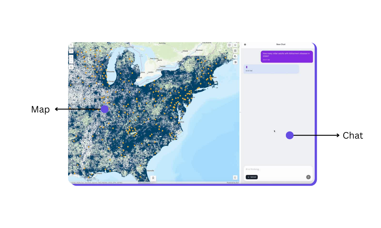
What part of the experience are you submitting?
We are submitting the core GeoChat product experience, specifically the end to end flow that allows a user to explore healthcare and social service markets through AI powered maps and natural language interaction.
Judges will see how a non technical user can start with a geography such as a state, county, or ZIP code and immediately view validated population, access, and provider data on an interactive map. From there, the experience centers on two tightly integrated actions. First, users can click anywhere on the map to reveal localized insights. Second, they can ask plain language questions about demand, access, and competition and receive grounded, data backed answers tied directly to the geography on screen.
The submission highlights how GeoChat removes traditional friction associated with GIS and market analysis. There is no need to clean data, build layers, write queries, or understand mapping software. Instead, the experience is designed to mirror how healthcare leaders actually think and work, moving from a question to a visual answer in seconds.
Why does this work stand out?
Four words: Make hard things easy.
This work stands out because GeoChat turns one of the most complex and exclusionary tools in healthcare into something that feels obvious to use.
Geospatial analysis has always been powerful and inaccessible. The data is there. The stakes are high. But the tools require specialized training, long setup times, and expert interpretation. As a result, most healthcare and social service leaders either avoid GIS altogether or rely on slow, expensive intermediaries. Decisions get made before the data ever shows up.
GeoChat flips that dynamic.
Instead of asking users to learn GIS, GeoChat learns how leaders think. You start with a question, not a dataset. You point to a place on a map and ask what’s happening there. The product responds instantly with a clear, visual answer grounded in credible data. No layers to configure. No queries to write. No technical translation step.
From a product design standpoint, the breakthrough is restraint. The interface removes everything that does not directly support decision making. Maps are interactive by default. Language is plain. The AI is intentionally scoped to avoid overreach and hallucination. Accuracy and clarity are treated as features, not tradeoffs.
What makes this work different is not that it adds more intelligence. It removes friction at exactly the moment decisions are made. By making a historically expert only tool usable in minutes, GeoChat changes who gets access to insight and when they get it.
You should try it too!
What does your product do, and who is it for?
GLP Winner is a price comparison marketplace that helps consumers find the right GLP-1 telehealth provider for weight loss medications like Ozempic, Wegovy, Mounjaro, Zepbound, compounded tirzepatide, and compounded semaglutide.
Consumers are often overwhelmed by the fragmented landscape of telehealth providers, confusing pricing structures, and inconsistent quality. Providers often have opaque pricing with hidden fees and bait-and-switch pricing; they force you to fill out a long funnel before you are even shown potential treatment plans. Consumers deserve transparency. They need clarity on what they'll actually pay, what's included, what other patients have said, and which provider fits their situation.
GLP Winner aggregates up-to-date provider and compounding pharmacy information into a familiar shopping experience where users can compare monthly costs, medication types, included services (like coaching or lab work), whether insurance is accepted, and more. We cut through AI slop, incentivized (and fake) reviews, and misleading pricing, so users can compare across providers and make informed decisions quickly.
We have connected over ten thousand patients, serve over 100,000 monthly active users, and have had half a million visitors since starting out as a Reddit project in 2024. Many are first-time GLP-1 patients navigating an unfamiliar category; others are switching providers due to cost or availability. Our product helps consumers navigate the ever-changing, chaotic space of GLP-1 providers.
What part of the experience are you submitting?
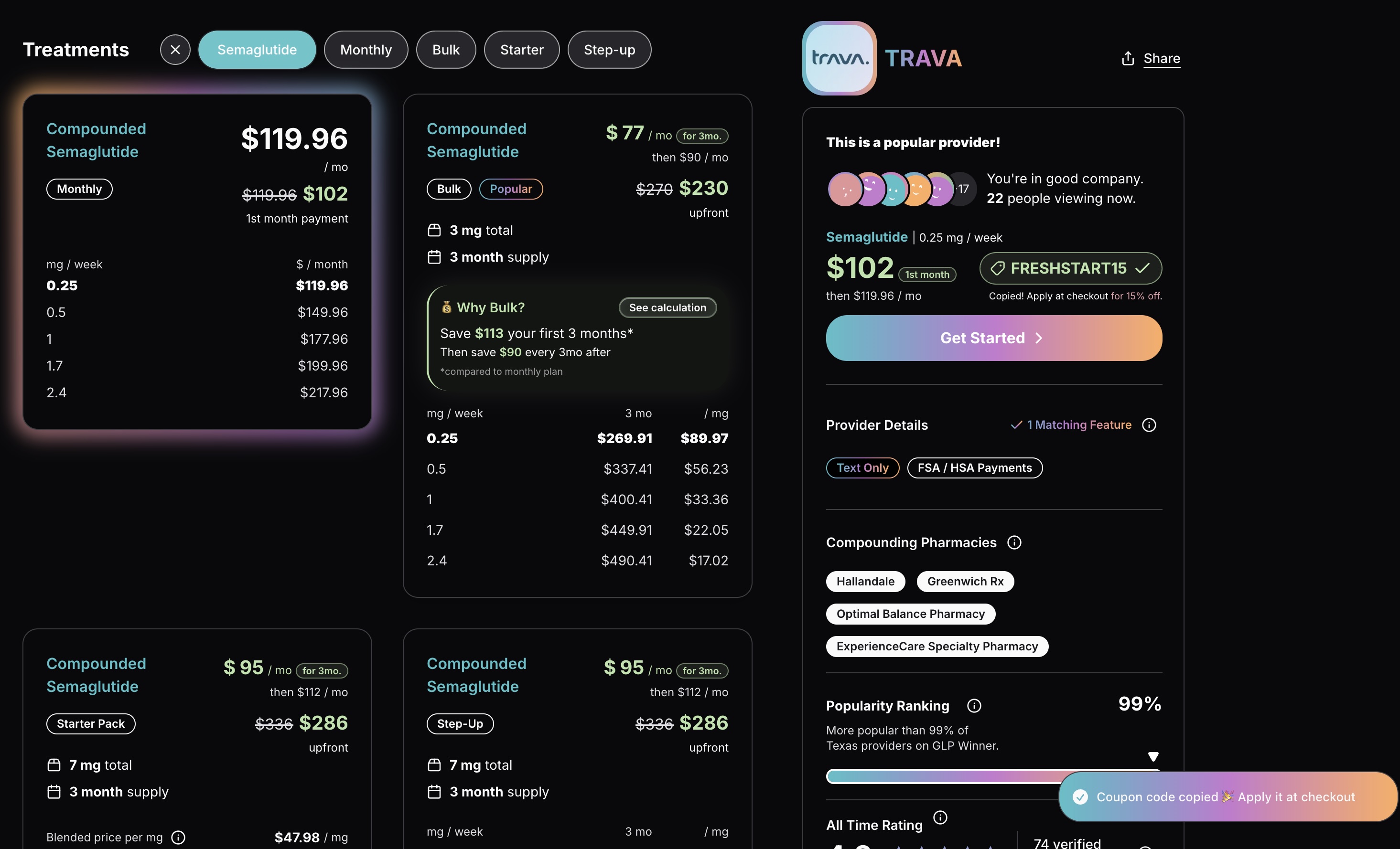
Results Page (file: desktop results page):
After completing a survey, users see a filtered list of providers matching their preferences. We prioritized scannability: filters (dosage, drug, plan type, sort order) should be immediately visible, and provider details read left-to-right on desktop. Real-time labels like "Patient Loved" and "Popular" surface consumer sentiment at a glance.
Provider Page (remaining screenshots + video):
Think of this as the ‘Product Details Page’ of an ecommerce site. This page shows all of the plans, reviews, and ratings for a specific provider. We borrow familiar UI patterns so choosing a provider feels like shopping on Amazon.
The experience adapts based on how users arrive.
For example, the current plans shown may be pre-filtered depending on what drug they are interested in. Showing all the plans would be too overwhelming and prevent the consumer from making a decision. The plan filter buttons take inspiration from Spotify's playlist filters: users can see what's available without the cognitive load of viewing all options at once. The playful interaction also encourages browsing in a low-pressure way.
We learned that consumers churn near the end of the provider’s funnel because they forgot their coupon. We built a cron job that searches and scrapes for coupons, and we surface them on the provider page. Users can click the coupon button to copy the code and show updated pricing. The icon jingles to draw attention without overshadowing the primary "Get Started" CTA. We want them to feel like GLP Winner helped them find the right deal.
We captured the mobile Provider Page to demonstrate progressive disclosure of dense information.
More info in Loom.
Why does this work stand out?
Patients are tired. Tired of deceptive telehealth funnels that force you through lengthy forms before revealing pricing. Tired of battling insurance and chasing prior auths that inevitably get rejected. We built GLP Winner around accessibility and transparency, and we let those values shape our every design decision.
We needed to be obviously different. We chose a dark backdrop with an iconic gradient because we didn't want to blend in with the pastel millennial aesthetic of most telehealth sites, or the sterile, safe colors of healthcare and big pharma. Peers (investors, founders, designers, and healthcare consultants) warned us: "You'll lose trust with dark colors." We disagreed. GLP-1s are a commodity; the discovery process isn't. This is the vertical we unapologetically own, and our design reflects that conviction.
Over 80% of our users browse on iPhone Safari, so we obsessed over native feel. Small touches like progressive disclosure, familiar interaction patterns, and liquid glass styling when iOS 26 dropped make the site feel like it belongs in Apple's ecosystem. If you can browse Spotify playlists, you can browse provider plans. If you can scroll Yelp, you can contribute meaningful reviews.
We aggregate reviews across platforms so consumers see the full picture. Real-time labels surface sentiment. Coupons are scraped and surfaced automatically. Even drug names are color coded to create an association between name brand and compounded (e.g., Wegovy, Ozempic, compounded semaglutide are teal and Mounjaro, Zepbound, and compounded tirzepatide are purple) Every feature exists to reduce friction and build trust.
You can be an iconoclast and still win mainstream adoption. Accessibility and transparency aren't just values. They're our competitive advantage. With over half a million people using our tool to compare options we are solving a critical problem.